Q&A 20 How do you reduce dimensions with PCA or t-SNE for visualization?
20.1 Explanation
High-dimensional data can be hard to visualize and interpret. Principal Component Analysis (PCA) and t-distributed Stochastic Neighbor Embedding (t-SNE) help reduce dimensionality while preserving structure:
- PCA: Linear transformation, good for quick exploration
- t-SNE: Nonlinear, better for preserving local relationships (e.g., clusters), but slower
These tools are commonly used for visualizing gene expression, customer segments, or clustering results.
20.2 Python Code
# PCA and t-SNE for dimensionality reduction
import pandas as pd
from sklearn.decomposition import PCA
from sklearn.manifold import TSNE
import matplotlib.pyplot as plt

# Load dataset
df = pd.read_csv("data/gene_expression_with_clusters.csv")

# Drop the ID column to keep only numeric features
X = df.drop(columns=["SampleID"])

# Apply PCA
pca = PCA(n_components=2)
X_pca = pca.fit_transform(X)

# Apply t-SNE (for comparison)
tsne = TSNE(n_components=2, perplexity=30, random_state=42)
X_tsne = tsne.fit_transform(X)

# Plot PCA
plt.figure(figsize=(12, 5))

plt.subplot(1, 2, 1)
plt.scatter(X_pca[:, 0], X_pca[:, 1], s=50, cmap="viridis")
plt.title("PCA Projection")
plt.xlabel("PC1")
plt.ylabel("PC2")

# Plot t-SNE
plt.subplot(1, 2, 2)
plt.scatter(X_tsne[:, 0], X_tsne[:, 1], s=50, cmap="viridis")
plt.title("t-SNE Projection")
plt.xlabel("Dim 1")
plt.ylabel("Dim 2")

plt.tight_layout()
plt.show()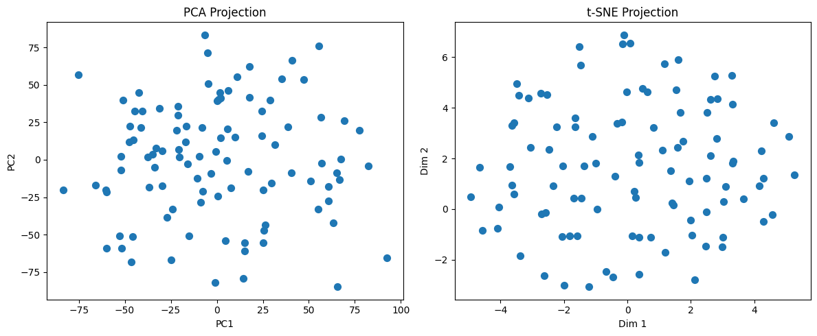
20.3 R Code
# Load necessary libraries
library(readr)
library(dplyr)
library(Rtsne)
library(ggplot2)

# Load the dataset
df <- read_csv("data/gene_expression_with_clusters.csv")

# Drop SampleID to keep only numeric features
X <- df %>% select(-SampleID)

# Perform PCA
pca_result <- prcomp(X, scale. = TRUE)
pca_df <- as.data.frame(pca_result$x[, 1:2])  # Take first two PCs
pca_df$Method <- "PCA"

# Perform t-SNE
set.seed(42)
tsne_result <- Rtsne(as.matrix(X), dims = 2, perplexity = 30)
tsne_df <- as.data.frame(tsne_result$Y)
colnames(tsne_df) <- c("Dim1", "Dim2")
tsne_df$Method <- "t-SNE"

# Rename PCA columns for consistency
colnames(pca_df)[1:2] <- c("Dim1", "Dim2")

# Combine both for visualization
combined_df <- bind_rows(pca_df, tsne_df)

# Plot using ggplot2
ggplot(combined_df, aes(x = Dim1, y = Dim2)) +
  geom_point(size = 2, alpha = 0.7) +
  facet_wrap(~Method) +
  labs(title = "PCA vs t-SNE Projection", x = "Dimension 1", y = "Dimension 2") +
  theme_minimal()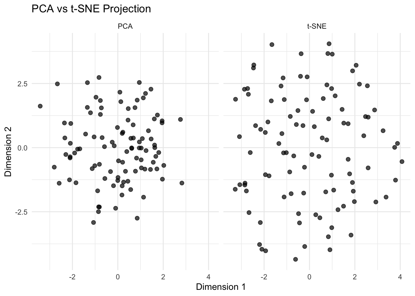
✅ Takeaway: Use PCA when you want a fast, linear projection that explains variance clearly. Use t-SNE when you’re interested in discovering hidden structure or clusters in complex, high-dimensional data. Both help you visualize relationships — and in real-world workflows, trying both can uncover patterns you might otherwise miss.