Q&A 22 How do you visualize clusters with UMAP in Python or R?
22.1 Explanation
UMAP (Uniform Manifold Approximation and Projection) is a powerful technique for visualizing high-dimensional data. Unlike PCA (which is linear) or t-SNE (which is good for local structure), UMAP preserves both local and global structure, making it ideal for revealing true shapes and patterns in your data.
In this example, we’ll use gene_expression_with_clusters.csv and apply UMAP after scaling the data.
22.2 Python Code
# UMAP visualization in Python
import pandas as pd
import matplotlib.pyplot as plt
from sklearn.preprocessing import StandardScaler
import umap

# Load and prepare data
df = pd.read_csv("data/gene_expression_with_clusters.csv")
X = df.drop(columns=["SampleID"], errors="ignore")

# Standardize
X_scaled = StandardScaler().fit_transform(X)

# Apply UMAP
reducer = umap.UMAP(random_state=42)
X_umap = reducer.fit_transform(X_scaled)

# Plot UMAP projection
plt.figure(figsize=(8, 6))
plt.scatter(X_umap[:, 0], X_umap[:, 1], s=50, cmap='viridis')
plt.title("UMAP Projection of Gene Expression Data")
plt.xlabel("UMAP1")
plt.ylabel("UMAP2")
plt.show()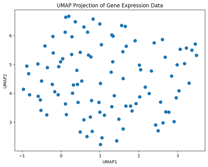
22.3 R Code
# UMAP visualization in R
library(readr)
library(dplyr)
library(umap)
library(ggplot2)

# Load data
df <- read_csv("data/gene_expression_with_clusters.csv")
X <- df %>% select(-SampleID)

# UMAP
set.seed(42)
umap_result <- umap(X)

# Convert to dataframe
umap_df <- as.data.frame(umap_result$layout)
colnames(umap_df) <- c("UMAP1", "UMAP2")

# Plot
ggplot(umap_df, aes(x = UMAP1, y = UMAP2)) +
  geom_point(size = 2) +
  labs(title = "UMAP Projection of Gene Expression Data") +
  theme_minimal()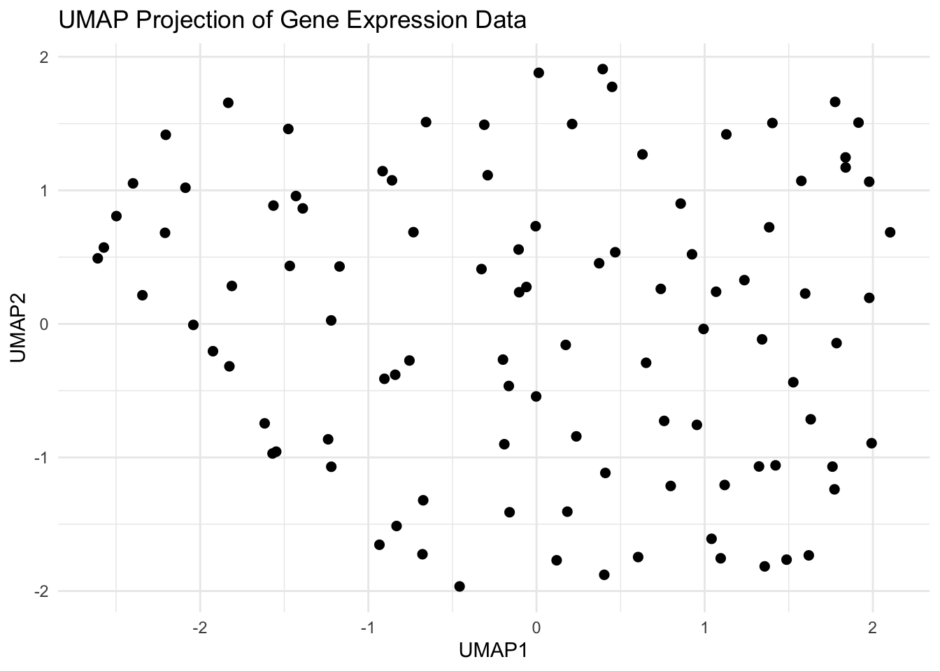
✅ Takeaway: UMAP reveals natural patterns and hidden structures in your data — especially useful when clusters aren’t spherical or linearly separable. It’s a go-to tool for modern dimensionality reduction and exploration.