Q&A 16 How do you visualize decision boundaries and understand model overfitting?
16.1 Explanation
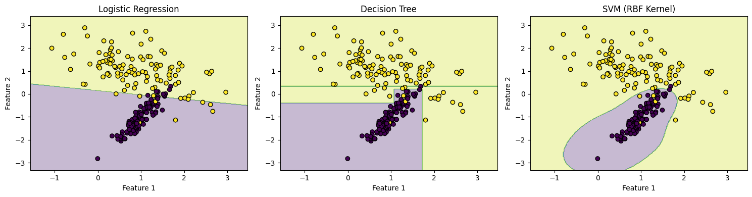
Decision boundaries help us visualize how a classifier separates classes in feature space. Simple models like logistic regression create linear boundaries, while more complex models (e.g., decision trees, SVMs) may create nonlinear ones.
However, a model that fits too closely to the training data — capturing noise instead of general patterns — may perform poorly on new data. This is known as overfitting.
We’ll simulate a classification task using two features to illustrate the decision boundaries of different classifiers.
16.2 Python Code
import matplotlib.pyplot as plt
from sklearn.datasets import make_classification
from sklearn.model_selection import train_test_split
from sklearn.linear_model import LogisticRegression
from sklearn.tree import DecisionTreeClassifier
from sklearn.svm import SVC
import numpy as np

# Simulate data
X, y = make_classification(n_samples=300, n_features=2, n_redundant=0, n_clusters_per_class=1, random_state=42)
X_train, X_test, y_train, y_test = train_test_split(X, y, random_state=42)

# Define classifiers
models = {
    "Logistic Regression": LogisticRegression(),
    "Decision Tree": DecisionTreeClassifier(max_depth=4),
    "SVM (RBF Kernel)": SVC(kernel='rbf', gamma=1)
}

# Plot decision boundaries
def plot_decision_boundary(model, X, y, title):
    model.fit(X, y)
    x_min, x_max = X[:, 0].min() - .5, X[:, 0].max() + .5
    y_min, y_max = X[:, 1].min() - .5, X[:, 1].max() + .5
    xx, yy = np.meshgrid(np.linspace(x_min, x_max, 300),
                         np.linspace(y_min, y_max, 300))
    Z = model.predict(np.c_[xx.ravel(), yy.ravel()])
    Z = Z.reshape(xx.shape)

    plt.contourf(xx, yy, Z, alpha=0.3)
    plt.scatter(X[:, 0], X[:, 1], c=y, edgecolors="k")
    plt.title(title)
    plt.xlabel("Feature 1")
    plt.ylabel("Feature 2")

plt.figure(figsize=(15, 4))
for i, (name, clf) in enumerate(models.items(), 1):
    plt.subplot(1, 3, i)
    plot_decision_boundary(clf, X_train, y_train, name)
plt.tight_layout()
plt.show()
16.3 R Code
library(ggplot2)
library(caret)
library(e1071)
library(rpart)

# Simulate data
set.seed(42)
df <- twoClassSim(300, linearVars = 2)
df$Class <- factor(df$Class)

# Plot decision boundaries using different models
plot_boundary <- function(model, title) {
  grid <- expand.grid(TwoFactor1 = seq(min(df$TwoFactor1), max(df$TwoFactor1), length.out = 100),
                      TwoFactor2 = seq(min(df$TwoFactor2), max(df$TwoFactor2), length.out = 100))
  preds <- predict(model, newdata = grid, type = "raw")
  grid$Class <- preds

  ggplot(df, aes(x = TwoFactor1, y = TwoFactor2, color = Class)) +
    geom_point(alpha = 0.7) +
    geom_contour(data = grid, aes(z = as.numeric(Class == levels(Class)[2])), bins = 1, color = "black") +
    labs(title = title) +
    theme_minimal()
}

# Train models
logit_model <- train(Class ~ TwoFactor1 + TwoFactor2, data = df, method = "glm", family = "binomial")
tree_model <- train(Class ~ TwoFactor1 + TwoFactor2, data = df, method = "rpart")
svm_model  <- train(Class ~ TwoFactor1 + TwoFactor2, data = df, method = "svmRadial")

# Display
plot_boundary(logit_model, "Logistic Regression")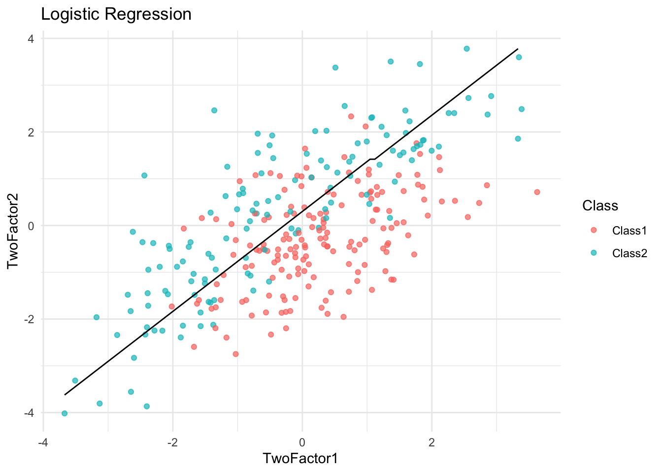
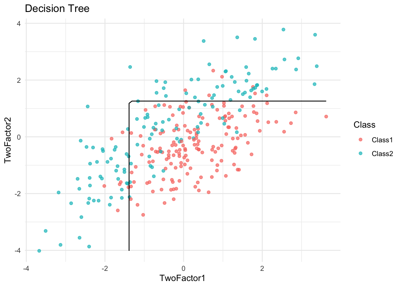
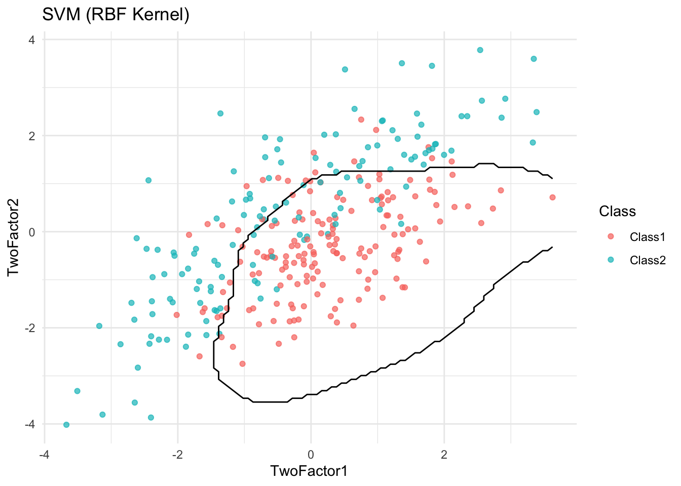
✅ Takeaway: Visualizing decision boundaries helps diagnose overfitting. Overly complex boundaries may suggest a model is fitting noise rather than true signal.