Q&A 5 How do you train and visualize a polynomial regression model using the Boston housing dataset?
5.1 Explanation
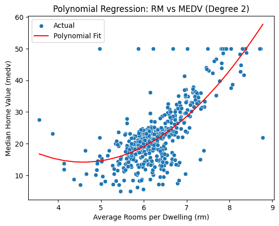
Polynomial regression is a simple extension of linear regression where we introduce higher-degree terms to model nonlinear relationships. In this example, we analyze how the number of rooms (rm) relates to home value (medv) using a quadratic (degree 2) fit. This helps capture curvature in the data without adding multiple features.
5.2 Python Code
import pandas as pd
import numpy as np
import matplotlib.pyplot as plt
import seaborn as sns
from sklearn.linear_model import LinearRegression
from sklearn.preprocessing import PolynomialFeatures

# Load dataset
df = pd.read_csv("data/boston_housing.csv")

# Prepare features
X = df[["rm"]]
y = df["medv"]

# Transform to polynomial features (degree 2)
poly = PolynomialFeatures(degree=2, include_bias=False)
X_poly = poly.fit_transform(X)

# Fit model
model = LinearRegression()
model.fit(X_poly, y)
df["Predicted"] = model.predict(X_poly)

# Plot
sns.scatterplot(x="rm", y="medv", data=df, label="Actual")
sns.lineplot(x="rm", y="Predicted", data=df.sort_values("rm"), color="red", label="Polynomial Fit")
plt.title("Polynomial Regression: RM vs MEDV (Degree 2)")
plt.xlabel("Average Rooms per Dwelling (rm)")
plt.ylabel("Median Home Value (medv)")
plt.show()
5.3 R Code
library(readr)
library(ggplot2)

# Load dataset
df <- read_csv("data/boston_housing.csv")

# Fit polynomial regression (degree 2)
model <- lm(medv ~ poly(rm, 2, raw = TRUE), data = df)
df$Predicted <- predict(model, newdata = df)

# Plot
ggplot(df, aes(x = rm, y = medv)) +
  geom_point(alpha = 0.6, color = "blue") +
  geom_line(aes(y = Predicted), color = "red", linewidth = 1) +
  labs(
    title = "Polynomial Regression: RM vs MEDV (Degree 2)",
    x = "Average Rooms per Dwelling (rm)",
    y = "Median Home Value (medv)"
  )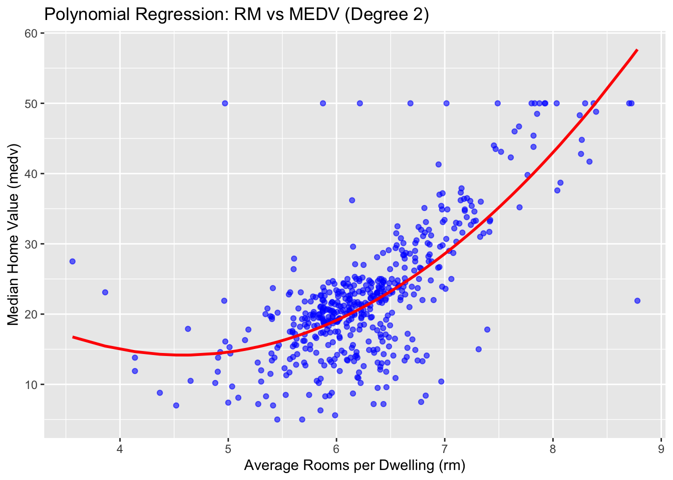
✅ Takeaway: Polynomial regression adds flexibility to capture curvature in feature-target relationships. However, it may overfit if the degree is too high or not validated carefully.